
[?]
This interview will be a bit different from the others. It will be more of a discussion since we are both the organizers and, at the same time, our own first exhibitors. How do we feel, as organizers, knowing that this Thursday our very first exhibition will open?
[Tomáš]
I’m really happy that we managed to make it happen, but at the same time, I still can’t fully grasp that it’s actually happening. Everything came together so quickly. From getting the grants to the actual realization. I’ll probably have different feelings after the first vernissage, depending on how many people come, what the reactions will be, and whether it’ll be successful. For now, I’m just full of expectations.
[Peter]
I’m mostly worried about how people will receive it, and whether it’ll be enough. But I think what helps me deal with that anxiety is the fact that I’m not doing this alone, that I’m doing it with you.
[Monika]
I’m honestly not that stressed about the vernissage itself. What stresses me out more is the fact that, at this moment, we still don’t have everything installed. So once I see that it can actually exist and function in the space, I’ll finally relax. I also think we feel a greater sense of responsibility because this is our very first exhibition. So far, we’ve had positive feedback, but I think people still don’t quite know what to expect. And also, these kinds of uncomfortable feelings… We’ll probably never experience them again to this extent, because right now they’re amplified by the fact that we’re both organizing and exhibiting at the same time.
[?]
How did this project come to be, and in what ways has its core idea changed since the beginning?
[Peter]
I feel like each of us came up with the idea at a different time, and then somehow it all came together in a form that’s quite different from the original one. Personally, I always wanted to install something in a public space. Something like Typopassage in Vienna. On the other hand, I’ve always been fascinated by those small display cases and information systems you find in parks or forests. I wanted to take typography into public space in a similar way. I’m really happy that [TypospoT] somehow captures the essence of that idea.
[Tomáš]
I remember that the first time we talked about it was when we wanted to create a small group of people interested in typography. We felt that a lot of projects ended up staying in drawers, and I wanted us to create something together. At first, there were quite a few of us, but over time it came down to just the three of us. I also wanted to exhibit typography, in a way that would be unconventional, perhaps in abandoned spaces, drawing attention by being out of place. The idea was to make people notice that typography exists and that it shouldn’t be overlooked.
[Monika]
I actually kind of invited myself to your first meeting of your “type club,” where you were talking about creating a small type foundry and consulting each other’s typefaces. That’s when we started talking about maybe organizing an event, and then I said I could try applying for a grant, even though I didn’t think we’d actually get it. But then, suddenly, we received some funding, and I realized… shit, we actually have to make this happen now.
The original idea of [TypospoT] was that it would happen several times a year, featuring exhibitions by young designers, which is something that stayed. What changed, though, is that originally, it was supposed to move around the city, with each installation reacting to the specific location where it was exhibited. But for various reasons, financial and logistical, that turned out to be impossible for now, so we had to let go of that idea.
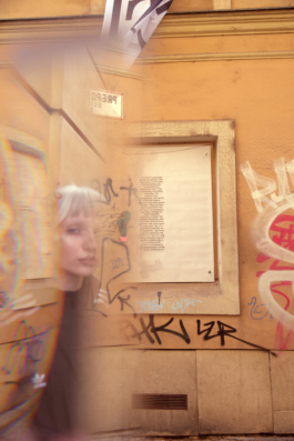
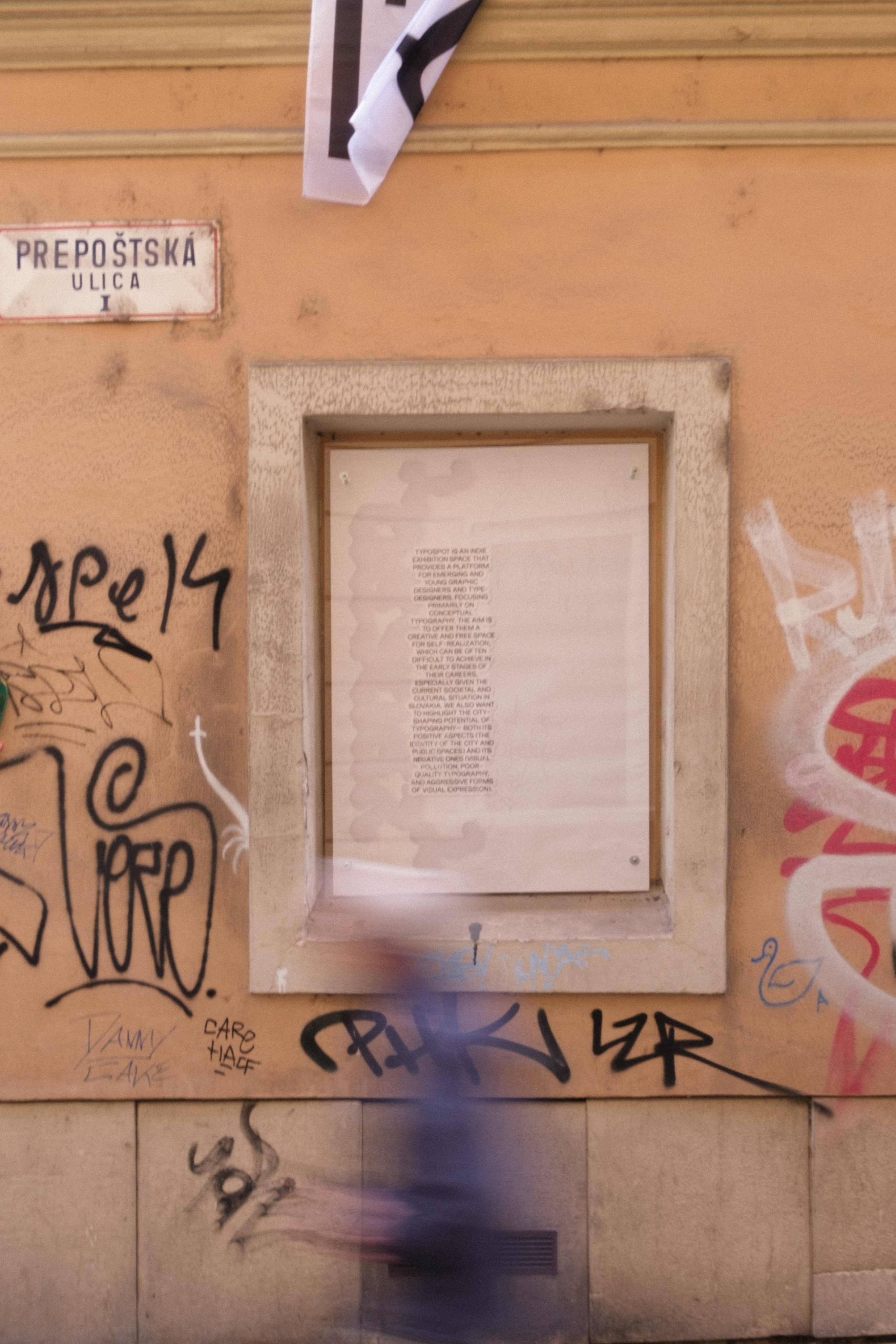
Later, we talked with Palo Bálik, telling him we didn’t have a space, and he mentioned that on the side façade of the Zichy Palace, there just happened to be some blind windows, and that the Old Town Cultural Centres would be happy to see them used for something. So [TypospoT] became a static spot, but its values remain the same. The only difference now is that the installations don’t respond to the physical location, but instead, the approach to typography should be conceptual, and the themes should deal with phenomena and issues relevant to the lives of young people.
[Peter]
I’m just wondering whether we’ll ever return to the idea of the type foundry: the reason this whole thing started in the first place. Do you think people left partly because we turned into an exhibition platform instead?
[Tomáš]
I think that’s mostly connected to the uncertainty that comes with starting something new, and we’ll probably talk about that more later. But, for example, even when I’m making typefaces myself, I often feel like, “What if they’re not good enough to put out there?” Starting a functional type foundry isn’t easy. I think that’s more of a long-term goal, but maybe one day, this will evolve into that as well. Maybe at first, we won’t sell typefaces, but at least we could inform people that they exist and maybe make them available upon request.
[Peter]
I agree. I actually think the name [TypospoT] works really well for a type foundry too. It could be like a multi-platform project.
[Monika]
Exactly. It’s a great name. Because it’s a spot both in real life and online.
[?]
What does [TypospoT] mean or symbolize for you?
[Monika]
I guess it depends on how the project develops, but what I like most about it is that our main value and priority is to give a platform to young people and emerging graphic designers. We know from experience how hard it is to start out. I don’t want to pretend that this is something groundbreaking, but I do feel like there aren’t many opportunities for young designers to exhibit in public space. I understand that people tend to give opportunities to those they’ve already had good experiences with, but that often means others, who may not have as much experience, yet whose work could be much more interesting and fresh, don’t get the chance. So if we can contribute, even just a little, to breaking down the stereotypes surrounding beginners, I’ll be really happy.
[Tomáš]
I think the reality is that we might be the only space like this in Slovakia. One that allows young designers to exhibit graphic design. Sure, in theory, students can take part in the Slovak Design Award, but overall, graphic design exhibitions here are pretty rare.
[Peter]
Yeah, that’s probably true. But readers can correct us if we’re wrong! And honestly, if there are more initiatives like this, that would make us happy! Maybe we could even collaborate! But as far as we know, we’re the only ones in Slovakia giving young designers the chance to exhibit graphic design in public space.
[?]
What inspired [TypospoT]’s visual identity?
[Peter]
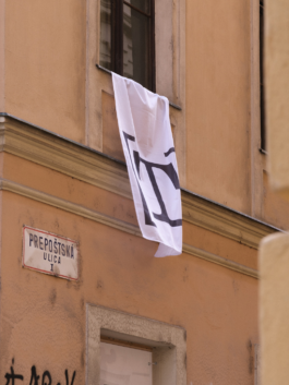
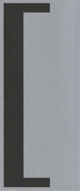
You could say it’s a site-specific design. The square bracket represents the blind window on the façade.
[Tomáš]
And what if we want to move it somewhere else one day? Would we redesign it?
[Monika]
I’d answer that a bit cryptically. Maybe if [TypospoT] ever opens up to another space, we’ll open the brackets.
[Peter]
I actually think the logo doesn’t necessarily need the original context to work. It functions well even if it’s used for another space, or even for the type foundry.
[Monika]
And the “T” itself... It’s kind of a classic syndrome. Whenever there’s “typo” in the name, we immediately feel like the T can stand for everything. Typogaráž, your Typoworkshop, Typoloose, Typolab… But to be fair, T is a naturally symmetrical letter, and it always looks good in a logo.
[?]
Why “[1]” as the theme of the first edition?
[Monika]
Maybe it’s a bit obvious, since it’s our first edition. I didn’t overthink it much, but I naturally started associating that number or word with other ideas. It can be about the number itself, or about the different meanings it carries. Like being the first, winning, but also solitude, identity, or beginnings. Just like [TypospoT] is beginning now. And the number one can also mean mono, like in monospace typefaces. There are many beautiful ways to interpret it.
[Peter]
I really like this theme, and I like that we plan to have a new theme every year. Some might be more concrete, others more abstract. We don’t yet know how the future exhibitors will respond, but I believe our exhibition will be the worst and most boring one. [TypospoT] manifesto.
[Monika]
That actually connects to our exhibition’s title, [le prélude]. The word generally means “a beginning,” but one that isn’t the most important, because bigger, better, more meaningful things are yet to come. It’s kind of our justification for being our own first exhibitors. We don’t want to suggest that our exhibition being first means it’s the most important or groundbreaking. Quite the opposite. We’re very aware that it’s not.
[Tomáš]
Honestly though, it was mostly a time thing. We didn’t want to put other exhibitors in a stressful situation. The kind of time pressure we’re in right now. There were many things we didn’t know until the last minute, and we had to react very quickly. We couldn’t rely on long-term planning, and we didn’t want to stress other people out. But I actually like that we decided to exhibit together, all three of us, because it somehow cancels out individuality, which in itself reflects the theme of unity, or “one.”
[Monika]
That also ties into the theme of beginnings. We’ve already talked about how [TypospoT]’s concept has evolved and about feelings of uncertainty, but every beginning, every journey, comes with expectations, doubts, and insecurities. Those feelings are characteristic of young designers, and they’ll probably keep coming back whenever we start something new. And right now, that sense of uncertainty feels especially strong in Slovakia.
Beginnings are also connected to what Tomáš mentioned. That a lot of things end up in drawers. Whether it’s typefaces or whole design concepts and abandoned projects. Often it’s because of clients. And we start to wonder: was it all pointless? Was it worth the time? The unpaid work?
[Tomáš]
It can definitely make you doubt yourself… Wondering if you’re doing something wrong or if it’s even worth it. I’ve been rejected a few times just because of the budget. Once, I even offered to design a logo for 100 euros, which is already ridiculously low, and still got turned down. At that point, I was desperate, wondering what I was doing wrong. But maybe I was just unlucky with the clients I met.
[Peter]
I don’t think you should ever feel bad about offering a 100-euro logo and being turned down for it.
[Monika]
Yeah, but when you’re just starting out and have no prior experience, many of us have encountered clients who think you should do something for 20 euros… And be grateful for it.
[?]
Why does our installation take the form of the [TypospoT] manifesto?
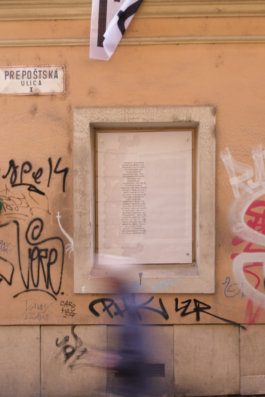
[Tomáš]
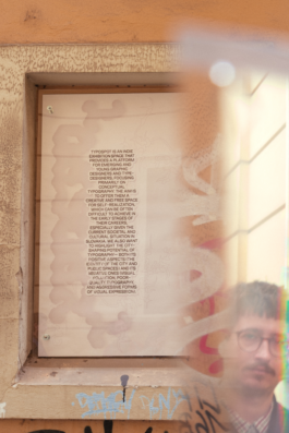
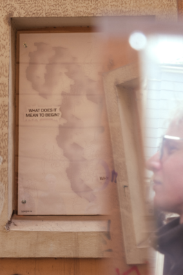
It just felt like the right way to begin. A way to introduce both the space and the project itself. Before, there was nothing there, and suddenly, there is something. People will pass by who don’t follow us on social media, so this is their chance to read something about the space and what it represents. It’s a pretty busy, touristy location, so it made sense to include that kind of introduction. But even though it’s a manifesto, I think we managed to make it visually engaging and authentic. Each of us is clearly present in it in our own way.
[?]
Visually, the installation is a mashup of our earlier projects. Ones that were “left in the drawer” or ended before they began. What kind of projects were they?
[Tomáš]
Mine was a typeface that ended up being used only for a logo and one social media post. I felt bad about it because it was quite a unique idea and never really reached its potential within that project. So I wanted to bring it back and give it a second life.
[Monika]
There are actually two elements from my past work. During my fifth year of studies at the Academy of Fine Arts and Design, I created a project called EVERYTHINGCORE, where I explored internet aesthetics and -cores. Later, I followed it up with TYPECORE, a project in which I made typefaces from different objects that somehow represented individual -cores. Many of these typefaces got lost in the process. When one character was finished, another one was created that replaced the previous one, so some disappeared entirely. But a few of the physical objects remained, including one typeface made from Bindeez, a childhood toy of mine. They’re these small beads that you place on a grid, spray with water, and then fuse together into jewelry or keychains. I originally wanted to digitize those typefaces, but didn’t have enough time, and my professors dismissed the idea as unnecessary. So I only digitized a few characters for myself, and those ended up being used here.
The second element comes from my early visual drafts for aimés, an album by FVLCRVM. There weren’t many versions. The final one was actually the second draft. But the first, unused version featured cybersigilistic patterns that I later pulled out and reused for this exhibition. It’s not particularly unique, though, since I often work with cybersigilism anyway.
[Peter]
My contribution is the T in the middle. The blurred, gradient one. But it’s now so far removed from my original piece that it’s almost unrecognizable. It came from a typeface I designed during my fifth year at the academy, called MC Farlands. It was inspired by glitched-out parts of Minecraft, around 26 million blocks from the spawn point, where the world generation starts breaking down and strange mountain-like patterns appear. I based the letterforms on those shapes and tried to reconstruct each character from them.
The idea was that the typeface would be used on 3D-printed spheres, as an imprinting or alternative writing tool. But in practice, the font didn’t really work for that, so it got shelved. It was used just once, on my social media, where I showed it off briefly, but otherwise, it had no real place. Now it reappears in a very abstract, reimagined way within the exhibition. The T is actually composed of fragments of those characters, not the literal “T” from the typeface itself.
[Monika]
My parts also aren’t immediately recognizable. But that’s what’s nice about it. We've pulled these forgotten projects out of the drawer and given them new meaning. It’s a symbolic reminder, and a transformation. The fact that they no longer look like what they once were is just another form of how beginnings evolve.
[?]
What’s your personal relationship to beginnings?
[Tomáš]
Maybe on a lighter note: we’ve just adopted a dog from a shelter. It’s been nine days now, though by the time this article comes out, it’ll be more. And we already have a rabbit at home, so there was a lot of uncertainty. Fears about how they’d get along, whether we’d sleep at night, all that. Those feelings of uncertainty can be unpleasant, but when things turn out fine, the relief is even sweeter. I often feel that way before any event I have to attend, even something as harmless as a Christmas party at school. I know nothing bad will happen, but I still get anxious.
[Peter]
I enjoy looking back at people who are now in the same position I was a few years ago, like current students, now that I’ve graduated. I’m not putting myself on any pedestal. Many of them know way more than I do, even though they’re younger. But I like watching them still search for themselves as designers. Not that I think I’ve fully found myself either. What I really like, though, is that kind of beginner’s naivety. The same energy we probably had when we started this project. For me, that’s a positive quality. A lot of people use “naivety” as a negative term, like it means being stupid. But for me, it’s motivating. It’s what pushes you to start things. I also love seeing that same idealistic spark in first-, second-, and third-year students. That sense of looking up to older designers or those who’ve already achieved something.
[Monika]
My default answer is that every beginning is, in some way, the ending of a previous chapter. For something new to emerge, something else has to end.
Anyway, I think we sometimes forget that, but it’s important to remember that we, too, once didn’t know anything. I went through that myself. I came to design school straight from grammar school, with no background in art or design, and a very naïve idea of what graphic design even was. I got accepted precisely because of that naivety, I think. Back then, we still had to submit physical portfolios, and mine was this fuzzy pink thing meant to look like a diary. I hand-bound it and covered it with pink plush fabric I’d cut up from an old vest. [[laughs]]
[?]
Are there any beginnings you genuinely enjoy?
[Monika]
The beginning of a movie. Or a game I’ve been looking forward to. It doesn’t even have to mean I’m starting a brand new game. More like I’ve finally found some time for myself, and I’m about to enjoy it. But honestly, I’m also genuinely happy about [TypospoT].
[Peter]
I actually like finishing things more than starting them. There was a time when I loved beginnings, but now I enjoy the feeling of completion. I do like certain kinds of beginnings, though. Like opening Figma and putting together a project brief, doing all the technical prep work around it. But as soon as I have to start thinking creatively, and if I don’t come up with a visual direction fairly quickly, I can lose motivation and burn out. That said, I also love starting video games.
[Tomáš]
For me, the most exciting part is starting to draw a typeface. After that, it often turns into a more technical process, which can get a bit boring. I tend to get the most enthusiastic right at the beginning of a project, but if it drags on too long, that initial spark fades, and I find it hard to go back to it.
[?]
What do you do outside of [TypospoT]?
[Peter]
I really enjoy those moments when I can step away from work. Even though I do like my job. It’s weird. I love standing up from my computer to check on my aquarium, or my plants. There are a lot of them. I basically have to take care of them every single day. I enjoy just existing in my apartment, noticing little details around me. Recently, Monika and I cleaned up, which I also found oddly satisfying: opening boxes, going through them, figuring out what I can throw away and what I can’t. It feels liberating to realize I don’t need certain things.
As for design… I somehow ended up in a situation where everyone keeps asking me to make websites. Which is fine. It pays the bills. And I guess I do enjoy it, but I’m not entirely sure how I feel about it from a work perspective.
[Monika]
I’m trying to finish my diploma thesis right now. Outside of that, I mostly focus… And would like to continue focusing… On book design, because that’s what fulfills me the most. I love working with print, the physicality and materiality of it. Even typesetting brings me joy. I also like designing visual identities for exhibitions.
But honestly, I’m not working much at the moment. And I don’t want this to sound self-pitying, but I’ve been dealing a lot with my health lately. It’s kind of symbolic, actually: a new beginning in its own way. I’ve never paid much attention to my health, not because I didn’t need to, but probably because I was ignoring some problems. For various reasons, I’ve been struggling with health issues for several months now, and they might not go away. That forced me to wake up a bit. People always say you should appreciate being healthy, and you shrug it off because you can’t really imagine what it’s like to lose that. Now I can. It’s a new beginning for me… Learning to live with a different physical state. It’s brought more negatives than positives, but it also made me realize a lot of things. And that’s something positive.
[Tomáš]
I’m busy with school and work, and, of course, I try to enjoy life, too. Whenever I get a chance to escape work, that’s when I’m happiest. Maybe if design were just a hobby, if I only made posters for friends now and then, I’d look forward to designing more. But most of the time I’ve just got too much on my plate, because I’m a bit of a yes-man. I spend my free time depending on how much of it I have left in the day. Often just a couple of hours. Lately, I’ve been spending it outside with my dog and my girlfriend. I like going out for coffee and unwinding with a good movie or series.
[?]
Why Capri-Sun as the signature drink for [TypospoT]?
[Tomáš]
I’m not sure which flavor we’ll pick yet, but for me, Mystic Dragon is super nostalgic. It reminds me of childhood. We wanted a non-alcoholic drink. We don’t drink, and we also want to keep our exhibition openings responsible. We don’t want people coming to our openings just because there’s free alcohol. We want them to come for the community and the cultural value of the event. That’s our statement.
[?]
What are your wishes for the future of [TypospoT]?
[Tomáš]
Full steam ahead!
[Monika]
A successful first year, with more beautiful installations. And then more beautiful and successful years after that.
[Peter]
We’ll see when it ends.
[?]
This interview will be a bit different from the others. It will be more of a discussion since we are both the organizers and, at the same time, our own first exhibitors. How do we feel, as organizers, knowing that this Thursday our very first exhibition will open?
[Tomáš]
I’m really happy that we managed to make it happen, but at the same time, I still can’t fully grasp that it’s actually happening. Everything came together so quickly. From getting the grants to the actual realization. I’ll probably have different feelings after the first vernissage, depending on how many people come, what the reactions will be, and whether it’ll be successful. For now, I’m just full of expectations.
[Peter]
I’m mostly worried about how people will receive it, and whether it’ll be enough. But I think what helps me deal with that anxiety is the fact that I’m not doing this alone, that I’m doing it with you.
[Monika]
I’m honestly not that stressed about the vernissage itself. What stresses me out more is the fact that, at this moment, we still don’t have everything installed. So once I see that it can actually exist and function in the space, I’ll finally relax. I also think we feel a greater sense of responsibility because this is our very first exhibition. So far, we’ve had positive feedback, but I think people still don’t quite know what to expect. And also, these kinds of uncomfortable feelings… We’ll probably never experience them again to this extent, because right now they’re amplified by the fact that we’re both organizing and exhibiting at the same time.
[?]
How did this project come to be, and in what ways has its core idea changed since the beginning?
[Peter]
I feel like each of us came up with the idea at a different time, and then somehow it all came together in a form that’s quite different from the original one. Personally, I always wanted to install something in a public space. Something like Typopassage in Vienna. On the other hand, I’ve always been fascinated by those small display cases and information systems you find in parks or forests. I wanted to take typography into public space in a similar way. I’m really happy that [TypospoT] somehow captures the essence of that idea.
[Tomáš]
I remember that the first time we talked about it was when we wanted to create a small group of people interested in typography. We felt that a lot of projects ended up staying in drawers, and I wanted us to create something together. At first, there were quite a few of us, but over time it came down to just the three of us. I also wanted to exhibit typography, in a way that would be unconventional, perhaps in abandoned spaces, drawing attention by being out of place. The idea was to make people notice that typography exists and that it shouldn’t be overlooked.
[Monika]
I actually kind of invited myself to your first meeting of your “type club,” where you were talking about creating a small type foundry and consulting each other’s typefaces. That’s when we started talking about maybe organizing an event, and then I said I could try applying for a grant, even though I didn’t think we’d actually get it. But then, suddenly, we received some funding, and I realized… shit, we actually have to make this happen now.
The original idea of [TypospoT] was that it would happen several times a year, featuring exhibitions by young designers, which is something that stayed. What changed, though, is that originally, it was supposed to move around the city, with each installation reacting to the specific location where it was exhibited. But for various reasons, financial and logistical, that turned out to be impossible for now, so we had to let go of that idea.
Later, we talked with Palo Bálik, telling him we didn’t have a space, and he mentioned that on the side façade of the Zichy Palace, there just happened to be some blind windows, and that the Old Town Cultural Centres would be happy to see them used for something. So [TypospoT] became a static spot, but its values remain the same. The only difference now is that the installations don’t respond to the physical location, but instead, the approach to typography should be conceptual, and the themes should deal with phenomena and issues relevant to the lives of young people.
[Peter]
I’m just wondering whether we’ll ever return to the idea of the type foundry: the reason this whole thing started in the first place. Do you think people left partly because we turned into an exhibition platform instead?
[Tomáš]
I think that’s mostly connected to the uncertainty that comes with starting something new, and we’ll probably talk about that more later. But, for example, even when I’m making typefaces myself, I often feel like, “What if they’re not good enough to put out there?” Starting a functional type foundry isn’t easy. I think that’s more of a long-term goal, but maybe one day, this will evolve into that as well. Maybe at first, we won’t sell typefaces, but at least we could inform people that they exist and maybe make them available upon request.
[Peter]
I agree. I actually think the name [TypospoT] works really well for a type foundry too. It could be like a multi-platform project.
[Monika]
Exactly. It’s a great name. Because it’s a spot both in real life and online.
[?]
What does [TypospoT] mean or symbolize for you?
[Monika]
I guess it depends on how the project develops, but what I like most about it is that our main value and priority is to give a platform to young people and emerging graphic designers. We know from experience how hard it is to start out. I don’t want to pretend that this is something groundbreaking, but I do feel like there aren’t many opportunities for young designers to exhibit in public space. I understand that people tend to give opportunities to those they’ve already had good experiences with, but that often means others, who may not have as much experience, yet whose work could be much more interesting and fresh, don’t get the chance. So if we can contribute, even just a little, to breaking down the stereotypes surrounding beginners, I’ll be really happy.
[Tomáš]
I think the reality is that we might be the only space like this in Slovakia. One that allows young designers to exhibit graphic design. Sure, in theory, students can take part in the Slovak Design Award, but overall, graphic design exhibitions here are pretty rare.
[Peter]
Yeah, that’s probably true. But readers can correct us if we’re wrong! And honestly, if there are more initiatives like this, that would make us happy! Maybe we could even collaborate! But as far as we know, we’re the only ones in Slovakia giving young designers the chance to exhibit graphic design in public space.
[?]
What inspired [TypospoT]’s visual identity?
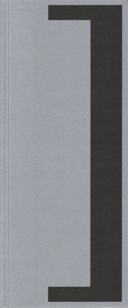
[Peter]
You could say it’s a site-specific design. The square bracket represents the blind window on the façade.
[Tomáš]
And what if we want to move it somewhere else one day? Would we redesign it?
[Monika]
I’d answer that a bit cryptically. Maybe if [TypospoT] ever opens up to another space, we’ll open the brackets.
[Peter]
I actually think the logo doesn’t necessarily need the original context to work. It functions well even if it’s used for another space, or even for the type foundry.
[Monika]
And the “T” itself... It’s kind of a classic syndrome. Whenever there’s “typo” in the name, we immediately feel like the T can stand for everything. Typogaráž, your Typoworkshop, Typoloose, Typolab… But to be fair, T is a naturally symmetrical letter, and it always looks good in a logo.
[?]
Why “[1]” as the theme of the first edition?
[Monika]
Maybe it’s a bit obvious, since it’s our first edition. I didn’t overthink it much, but I naturally started associating that number or word with other ideas. It can be about the number itself, or about the different meanings it carries. Like being the first, winning, but also solitude, identity, or beginnings. Just like [TypospoT] is beginning now. And the number one can also mean mono, like in monospace typefaces. There are many beautiful ways to interpret it.
[Peter]
I really like this theme, and I like that we plan to have a new theme every year. Some might be more concrete, others more abstract. We don’t yet know how the future exhibitors will respond, but I believe our exhibition will be the worst and most boring one. [TypospoT] manifesto.
[Monika]
That actually connects to our exhibition’s title, [le prélude]. The word generally means “a beginning,” but one that isn’t the most important, because bigger, better, more meaningful things are yet to come. It’s kind of our justification for being our own first exhibitors. We don’t want to suggest that our exhibition being first means it’s the most important or groundbreaking. Quite the opposite. We’re very aware that it’s not.
[Tomáš]
Honestly though, it was mostly a time thing. We didn’t want to put other exhibitors in a stressful situation. The kind of time pressure we’re in right now. There were many things we didn’t know until the last minute, and we had to react very quickly. We couldn’t rely on long-term planning, and we didn’t want to stress other people out. But I actually like that we decided to exhibit together, all three of us, because it somehow cancels out individuality, which in itself reflects the theme of unity, or “one.”
[Monika]
That also ties into the theme of beginnings. We’ve already talked about how [TypospoT]’s concept has evolved and about feelings of uncertainty, but every beginning, every journey, comes with expectations, doubts, and insecurities. Those feelings are characteristic of young designers, and they’ll probably keep coming back whenever we start something new. And right now, that sense of uncertainty feels especially strong in Slovakia.
Beginnings are also connected to what Tomáš mentioned. That a lot of things end up in drawers. Whether it’s typefaces or whole design concepts and abandoned projects. Often it’s because of clients. And we start to wonder: was it all pointless? Was it worth the time? The unpaid work?
[Tomáš]
It can definitely make you doubt yourself… Wondering if you’re doing something wrong or if it’s even worth it. I’ve been rejected a few times just because of the budget. Once, I even offered to design a logo for 100 euros, which is already ridiculously low, and still got turned down. At that point, I was desperate, wondering what I was doing wrong. But maybe I was just unlucky with the clients I met.
[Peter]
I don’t think you should ever feel bad about offering a 100-euro logo and being turned down for it.
[Monika]
Yeah, but when you’re just starting out and have no prior experience, many of us have encountered clients who think you should do something for 20 euros… And be grateful for it.
[?]
Why does our installation take the form of the [TypospoT] manifesto?
[Tomáš]
It just felt like the right way to begin. A way to introduce both the space and the project itself. Before, there was nothing there, and suddenly, there is something. People will pass by who don’t follow us on social media, so this is their chance to read something about the space and what it represents. It’s a pretty busy, touristy location, so it made sense to include that kind of introduction. But even though it’s a manifesto, I think we managed to make it visually engaging and authentic. Each of us is clearly present in it in our own way.
[?]
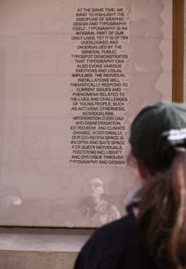
Visually, the installation is a mashup of our earlier projects. Ones that were “left in the drawer” or ended before they began. What kind of projects were they?
[Tomáš]
Mine was a typeface that ended up being used only for a logo and one social media post. I felt bad about it because it was quite a unique idea and never really reached its potential within that project. So I wanted to bring it back and give it a second life.
[Monika]
There are actually two elements from my past work. During my fifth year of studies at the Academy of Fine Arts and Design, I created a project called EVERYTHINGCORE, where I explored internet aesthetics and -cores. Later, I followed it up with TYPECORE, a project in which I made typefaces from different objects that somehow represented individual -cores. Many of these typefaces got lost in the process. When one character was finished, another one was created that replaced the previous one, so some disappeared entirely. But a few of the physical objects remained, including one typeface made from Bindeez, a childhood toy of mine. They’re these small beads that you place on a grid, spray with water, and then fuse together into jewelry or keychains. I originally wanted to digitize those typefaces, but didn’t have enough time, and my professors dismissed the idea as unnecessary. So I only digitized a few characters for myself, and those ended up being used here.
The second element comes from my early visual drafts for aimés, an album by FVLCRVM. There weren’t many versions. The final one was actually the second draft. But the first, unused version featured cybersigilistic patterns that I later pulled out and reused for this exhibition. It’s not particularly unique, though, since I often work with cybersigilism anyway.
[Peter]
My contribution is the T in the middle. The blurred, gradient one. But it’s now so far removed from my original piece that it’s almost unrecognizable. It came from a typeface I designed during my fifth year at the academy, called MC Farlands. It was inspired by glitched-out parts of Minecraft, around 26 million blocks from the spawn point, where the world generation starts breaking down and strange mountain-like patterns appear. I based the letterforms on those shapes and tried to reconstruct each character from them.
The idea was that the typeface would be used on 3D-printed spheres, as an imprinting or alternative writing tool. But in practice, the font didn’t really work for that, so it got shelved. It was used just once, on my social media, where I showed it off briefly, but otherwise, it had no real place. Now it reappears in a very abstract, reimagined way within the exhibition. The T is actually composed of fragments of those characters, not the literal “T” from the typeface itself.
[Monika]
My parts also aren’t immediately recognizable. But that’s what’s nice about it. We've pulled these forgotten projects out of the drawer and given them new meaning. It’s a symbolic reminder, and a transformation. The fact that they no longer look like what they once were is just another form of how beginnings evolve.
[?]
What’s your personal relationship to beginnings?
[Tomáš]
Maybe on a lighter note: we’ve just adopted a dog from a shelter. It’s been nine days now, though by the time this article comes out, it’ll be more. And we already have a rabbit at home, so there was a lot of uncertainty. Fears about how they’d get along, whether we’d sleep at night, all that. Those feelings of uncertainty can be unpleasant, but when things turn out fine, the relief is even sweeter. I often feel that way before any event I have to attend, even something as harmless as a Christmas party at school. I know nothing bad will happen, but I still get anxious.
[Peter]
I enjoy looking back at people who are now in the same position I was a few years ago, like current students, now that I’ve graduated. I’m not putting myself on any pedestal. Many of them know way more than I do, even though they’re younger. But I like watching them still search for themselves as designers. Not that I think I’ve fully found myself either. What I really like, though, is that kind of beginner’s naivety. The same energy we probably had when we started this project. For me, that’s a positive quality. A lot of people use “naivety” as a negative term, like it means being stupid. But for me, it’s motivating. It’s what pushes you to start things. I also love seeing that same idealistic spark in first-, second-, and third-year students. That sense of looking up to older designers or those who’ve already achieved something.
[Monika]
My default answer is that every beginning is, in some way, the ending of a previous chapter. For something new to emerge, something else has to end.
Anyway, I think we sometimes forget that, but it’s important to remember that we, too, once didn’t know anything. I went through that myself. I came to design school straight from grammar school, with no background in art or design, and a very naïve idea of what graphic design even was. I got accepted precisely because of that naivety, I think. Back then, we still had to submit physical portfolios, and mine was this fuzzy pink thing meant to look like a diary. I hand-bound it and covered it with pink plush fabric I’d cut up from an old vest. [[laughs]]
[?]
Are there any beginnings you genuinely enjoy?
[Monika]
The beginning of a movie. Or a game I’ve been looking forward to. It doesn’t even have to mean I’m starting a brand new game. More like I’ve finally found some time for myself, and I’m about to enjoy it. But honestly, I’m also genuinely happy about [TypospoT].
[Peter]
I actually like finishing things more than starting them. There was a time when I loved beginnings, but now I enjoy the feeling of completion. I do like certain kinds of beginnings, though. Like opening Figma and putting together a project brief, doing all the technical prep work around it. But as soon as I have to start thinking creatively, and if I don’t come up with a visual direction fairly quickly, I can lose motivation and burn out. That said, I also love starting video games.
[Tomáš]
For me, the most exciting part is starting to draw a typeface. After that, it often turns into a more technical process, which can get a bit boring. I tend to get the most enthusiastic right at the beginning of a project, but if it drags on too long, that initial spark fades, and I find it hard to go back to it.
[?]
What do you do outside of [TypospoT]?
[Peter]
I really enjoy those moments when I can step away from work. Even though I do like my job. It’s weird. I love standing up from my computer to check on my aquarium, or my plants. There are a lot of them. I basically have to take care of them every single day. I enjoy just existing in my apartment, noticing little details around me. Recently, Monika and I cleaned up, which I also found oddly satisfying: opening boxes, going through them, figuring out what I can throw away and what I can’t. It feels liberating to realize I don’t need certain things.
As for design… I somehow ended up in a situation where everyone keeps asking me to make websites. Which is fine. It pays the bills. And I guess I do enjoy it, but I’m not entirely sure how I feel about it from a work perspective.
[Monika]
I’m trying to finish my diploma thesis right now. Outside of that, I mostly focus… And would like to continue focusing… On book design, because that’s what fulfills me the most. I love working with print, the physicality and materiality of it. Even typesetting brings me joy. I also like designing visual identities for exhibitions.
But honestly, I’m not working much at the moment. And I don’t want this to sound self-pitying, but I’ve been dealing a lot with my health lately. It’s kind of symbolic, actually: a new beginning in its own way. I’ve never paid much attention to my health, not because I didn’t need to, but probably because I was ignoring some problems. For various reasons, I’ve been struggling with health issues for several months now, and they might not go away. That forced me to wake up a bit. People always say you should appreciate being healthy, and you shrug it off because you can’t really imagine what it’s like to lose that. Now I can. It’s a new beginning for me… Learning to live with a different physical state. It’s brought more negatives than positives, but it also made me realize a lot of things. And that’s something positive.
[Tomáš]
I’m busy with school and work, and, of course, I try to enjoy life, too. Whenever I get a chance to escape work, that’s when I’m happiest. Maybe if design were just a hobby, if I only made posters for friends now and then, I’d look forward to designing more. But most of the time I’ve just got too much on my plate, because I’m a bit of a yes-man. I spend my free time depending on how much of it I have left in the day. Often just a couple of hours. Lately, I’ve been spending it outside with my dog and my girlfriend. I like going out for coffee and unwinding with a good movie or series.
[?]
Why Capri-Sun as the signature drink for [TypospoT]?
[Tomáš]
I’m not sure which flavor we’ll pick yet, but for me, Mystic Dragon is super nostalgic. It reminds me of childhood. We wanted a non-alcoholic drink. We don’t drink, and we also want to keep our exhibition openings responsible. We don’t want people coming to our openings just because there’s free alcohol. We want them to come for the community and the cultural value of the event. That’s our statement.
[?]
What are your wishes for the future of [TypospoT]?
[Tomáš]
Full steam ahead!
[Monika]
A successful first year, with more beautiful installations. And then more beautiful and successful years after that.
[Peter]
We’ll see when it ends.
Open Call